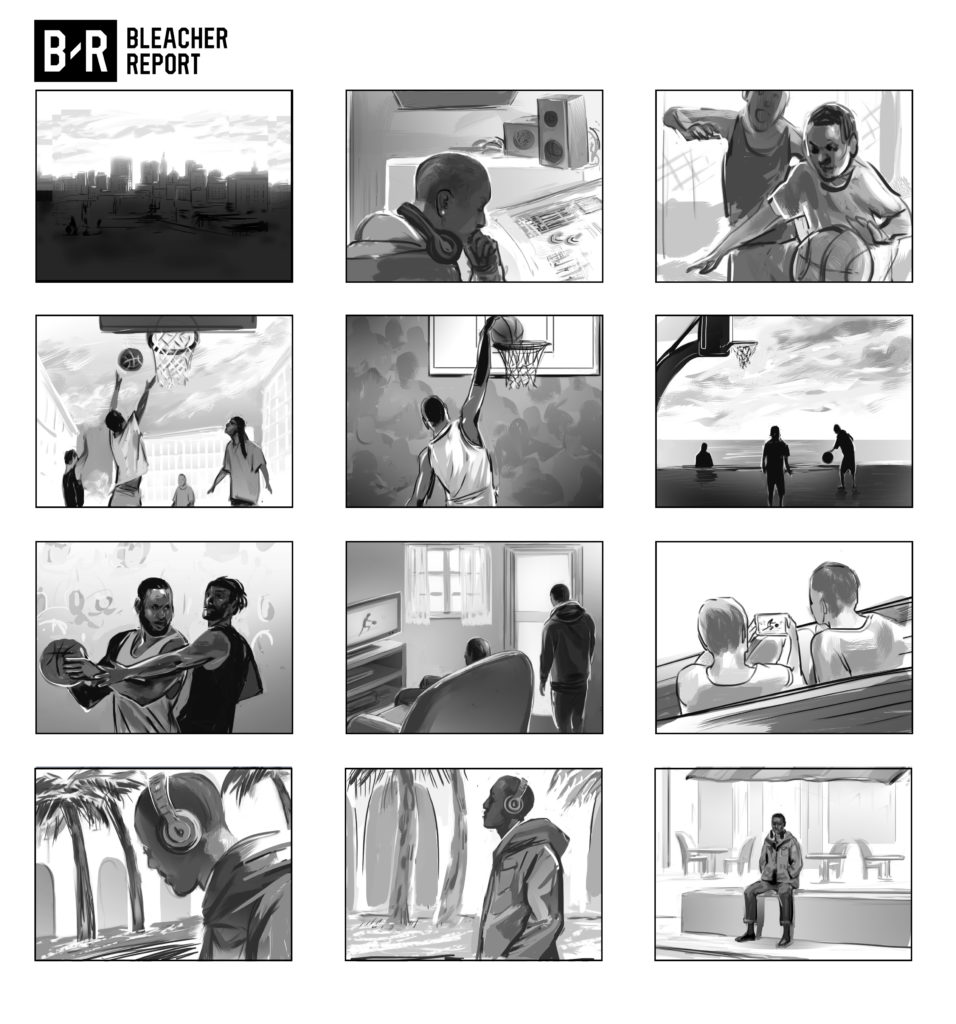
One of the most popular methods of storyboarding is black and white shading. Unlike simple line drawing, adding a little shade to your image adds a lot more definition and context to the scene, separating out background from foreground, and demonstrating a sense of lighting and emphasis for the illustrated scenes. If you’re looking for clarity and detail on a time crunch, then black and white shaded storyboards (sometimes with a small pop of color here or there if necessary) are your best option.

There are several techniques I use to approach shading. The above example shows a more “painterly” technique that treats the shades as shapes and forms as opposed to simply “filling in” linework with shading. Here, the linework and shading is done at the same time, resulting in a more fluid, unified look.

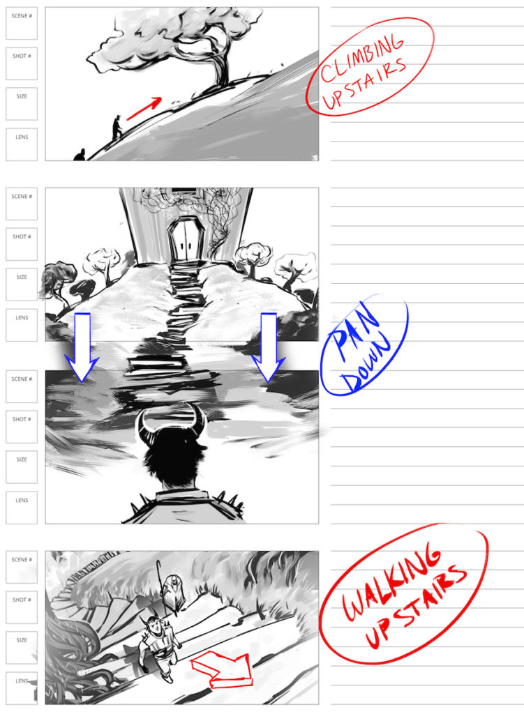
Above are storyboards where the linework was done separately from the shading, and the shading was implemented using gradients instead of digital brushes. It creates a cleaner, more commercial look, and is better for storyboards that depict products or manufactured objects.

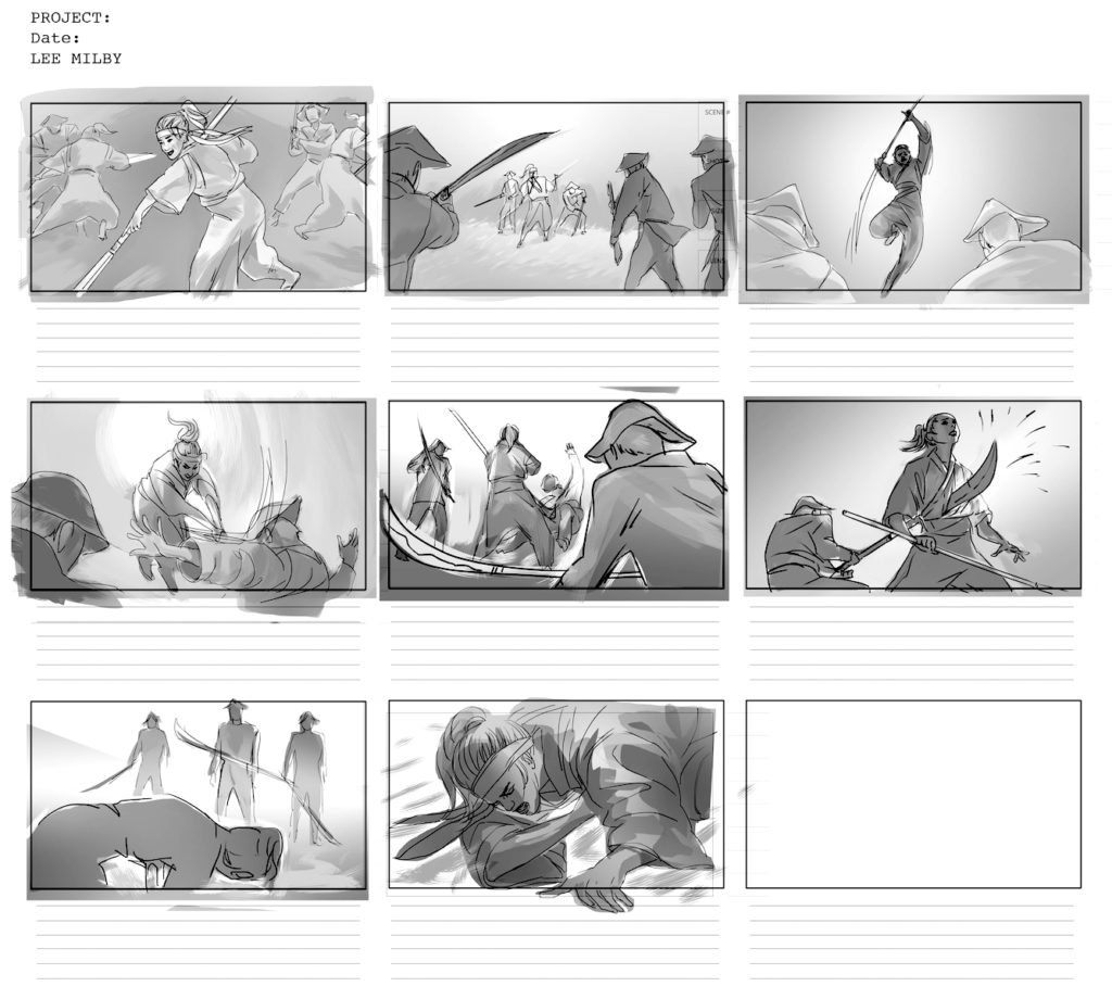
Here is a storyboard that blends the previous two techniques. There was an initial sketch, followed by cleaner linework, and then shading filled in using an equal blend of gradients and digital brushes. This created a clear representation of action, while still allowing for a sense of movement and action in the boards.


